nexmart - Business App
Overview
Transformed legacy interfaces into a cohesive, accessible experience using Material Design 3. Aligned with complex business requirements with the unique accessibility needs of an older demographic, delivering a finalized design system optimized for development over the course of three months.
Role
Product Design Intern
Team
1 Lead Designer, 2 POs, Engineering
Duration
3 months
Deliverables
UI Kit, Web App & Dashboards
Context & Motivation
These changes were initiated by a client whose workflow was being directly impacted by existing issues in the application. The feedback arrived incrementally over time rather than as a single brief, requiring the team to absorb and prioritize requests in an agile manner. The underlying business goal was clear: deliver meaningful improvements within a tight window to demonstrate the product's value and retain the client.
Challenges
The rework was shaped by real constraints. The timeline was driven by business urgency rather than a structured project plan, leaving limited room for a conventional research and testing phase. Feedback from multiple clients was in scope for the broader redesign, though my work focused specifically on the features directly tied to the primary client's concerns.
User Research Summary
Personas and journey maps were built on existing product knowledge and assumptions, as outlined in the project introduction. The primary user is a supplier in the 35–55 age range, frequently on the road and context-switching between devices. He is not technically inclined and uses his tablet or phone strictly for work essentials. Connectivity is unreliable, time is scarce, and his tolerance for unclear or missed feedback is low. These constraints shaped every design decision in this project — particularly around how and how long the app communicates the result of a user's action.
User Persona
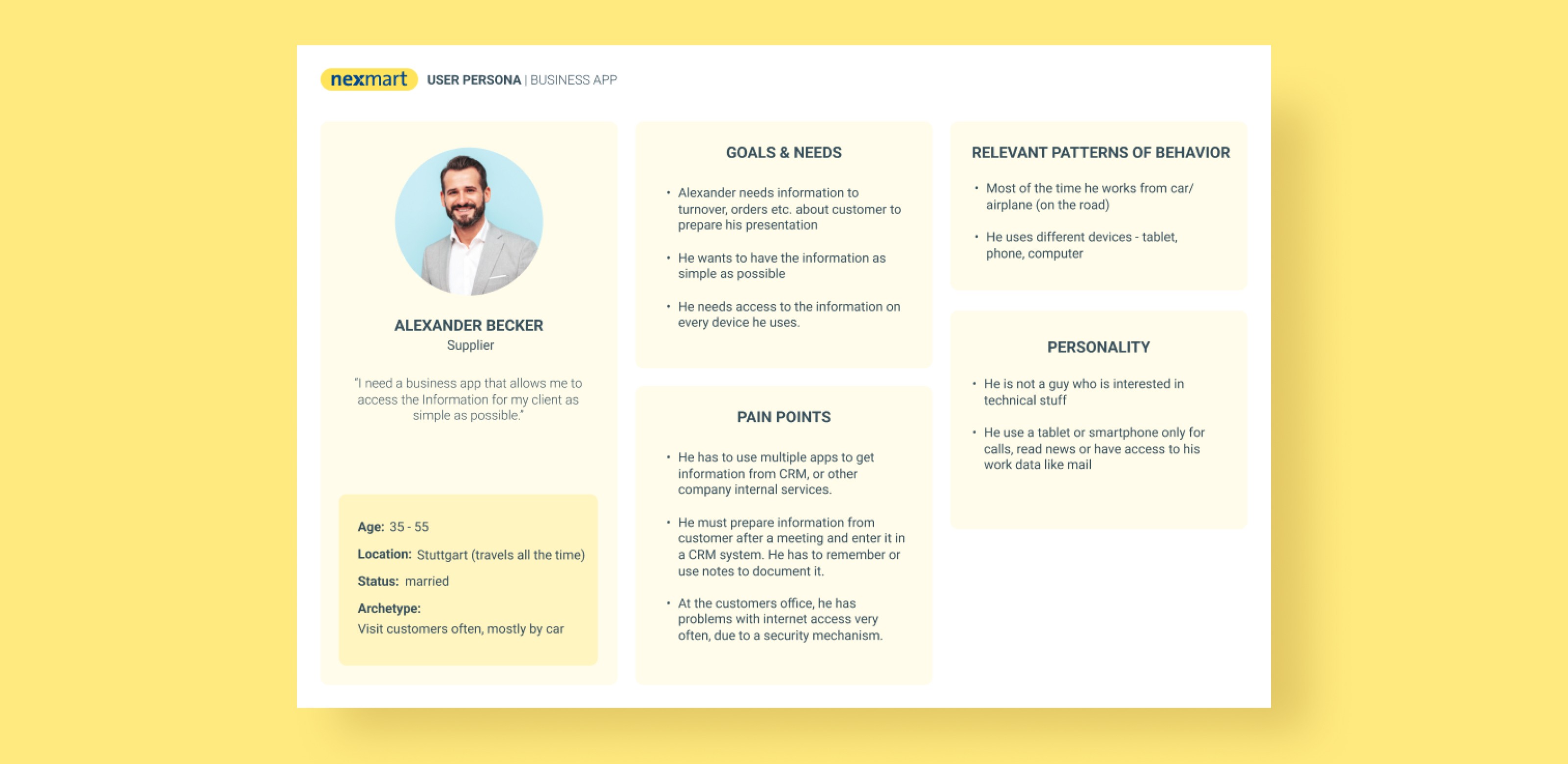
Alexander represents a user who cannot afford to second-guess the app. Preparing client presentations on the go, often with poor internet access, he depends on the interface to confirm his actions clearly and immediately. The miscolored tooltip and the sub-second snackbar were not minor visual inconsistencies for a user like Alexander — they were direct blockers to trust and efficiency in an already demanding work context.
Validation Approach
Without the time or resources for formal usability testing, validation was handled through two complementary channels. An external design team — with whom the company had an established working relationship — conducted a usability evaluation followed by a design consultation, providing structured critique from an outside perspective. In parallel, the project's PO gathered and relayed feedback from the client on how the updated application was received in practice. Together, these served as a pragmatic alternative to traditional testing under the given constraints.
AI-Assisted Design
Figma Make was used throughout this project as a design accelerator. It allowed me to iterate through multiple design directions quickly, preview potential animations before committing to them, and generate transition-ready prototypes without manual setup. For specific components — including the snackbar, tables, and widgets in the bonus project — it served as a starting point that was then refined and adapted to meet the project's requirements. AI output was never used as a final solution; it was always a basis for further design decisions.
Catalogue | System Feedback
Sub-Problem Summary
In the live app, the colours used by the developers did not reflect the design, which could lead users to treat the tooltip as a warning. The snackbar was also shown for less than a second which the users did not have the time to read.
Solution Summary
Extended feedback duration for the 'Add to Cart' snackbar to accommodate slower visual processing speeds. I introduced persistent context clues and a clear information hierarchy, allowing users to verify their actions and scan cart contents with confidence. The tooltip was replaced by a small label on the item card showing that an instance of the item is present in the cart.
Snackbar iterations
The discussion arising from the concepts concluded with the last concept being liked the best. It would fit in the new app's layout where the cart icon is moved above the snackbar. Additionally, the "added to cart" state will not be used as the PO clarified that one item has many instances that can be added to the cart.
Refined versions
These two alternatives were showcased alongside the accepted design at the previous stage. It was decided that a more minimalistic design will provide just enough information for the users in our age group without overwhelming them. The duration the snackbar was shown was also adjusted to be 3 seconds.
It is important to note that if multiple items are added to the cart at the same time, the snackbar will just switch the item information (image and description) without it re-appearing all the time.
Final Solution
Documents | Document Discovery
Sub-Problem Summary
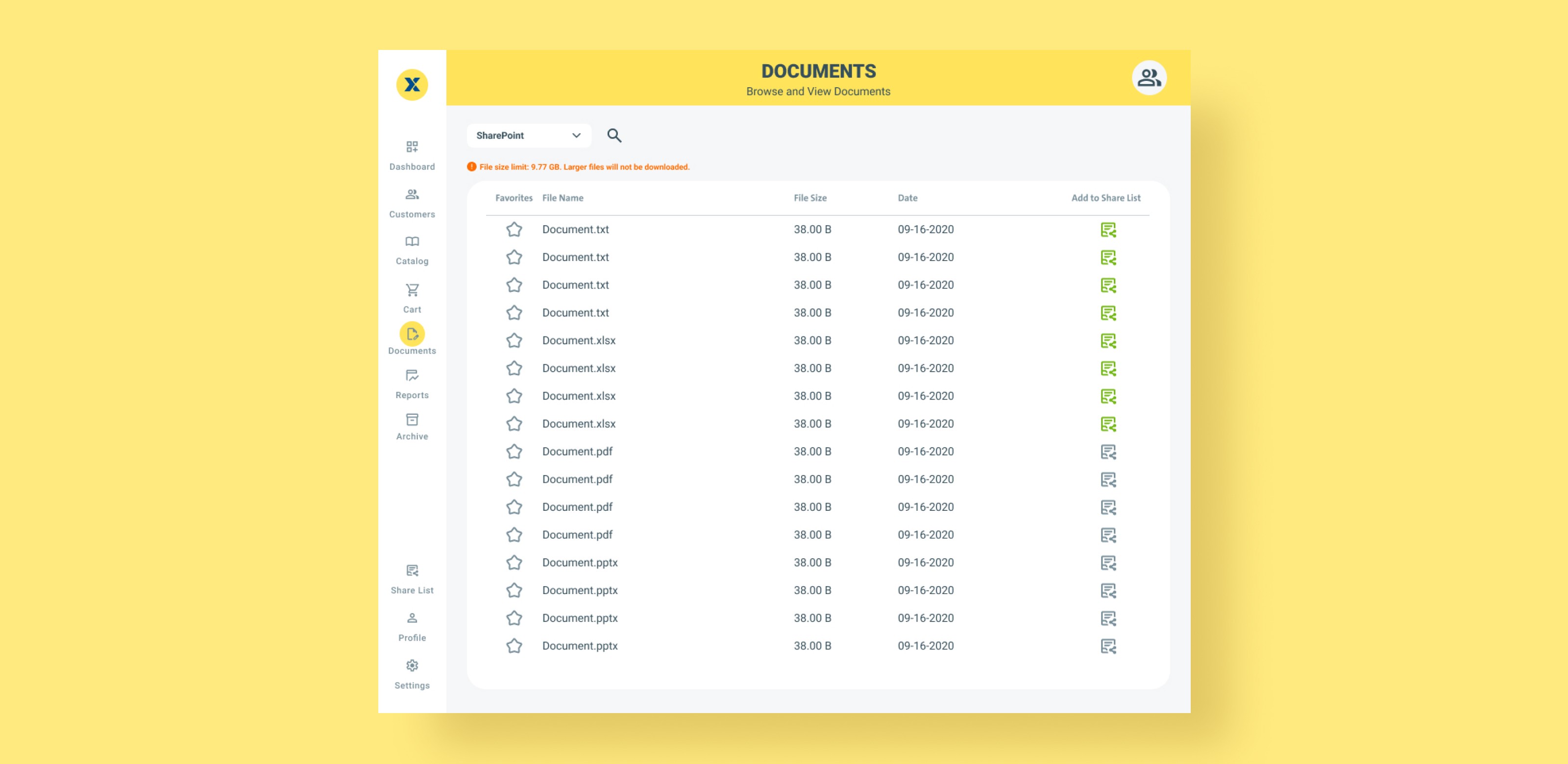
The legacy application lacked a filtering system, forcing users to manually scan thousands of entries—a process that imposed a high cognitive load. Through a holistic evaluation, I identified a lack of batch file control and a critical feedback failure: the 'Add to Share List' icon lacked distinct toggled and untoggled states, leaving users uncertain of their system's status.
Solution Summary
Simplification of the ‘Add to Share List’ action: Iterated on the icons that could replace the current one, buttons and with the input of an external designer, we ended up with the version where we have a button with “+Add” and “Added” labels for best clarity.
Batch select: Creating a separate table concept that support batch select that allows users to skip steps when needing to work with multiple files at the same time.
Standardization: I replaced the starring system for the bookmarking system as that is more common and wide-spread amongst other applications. This should make the system more straightforward for new users.
First Draft
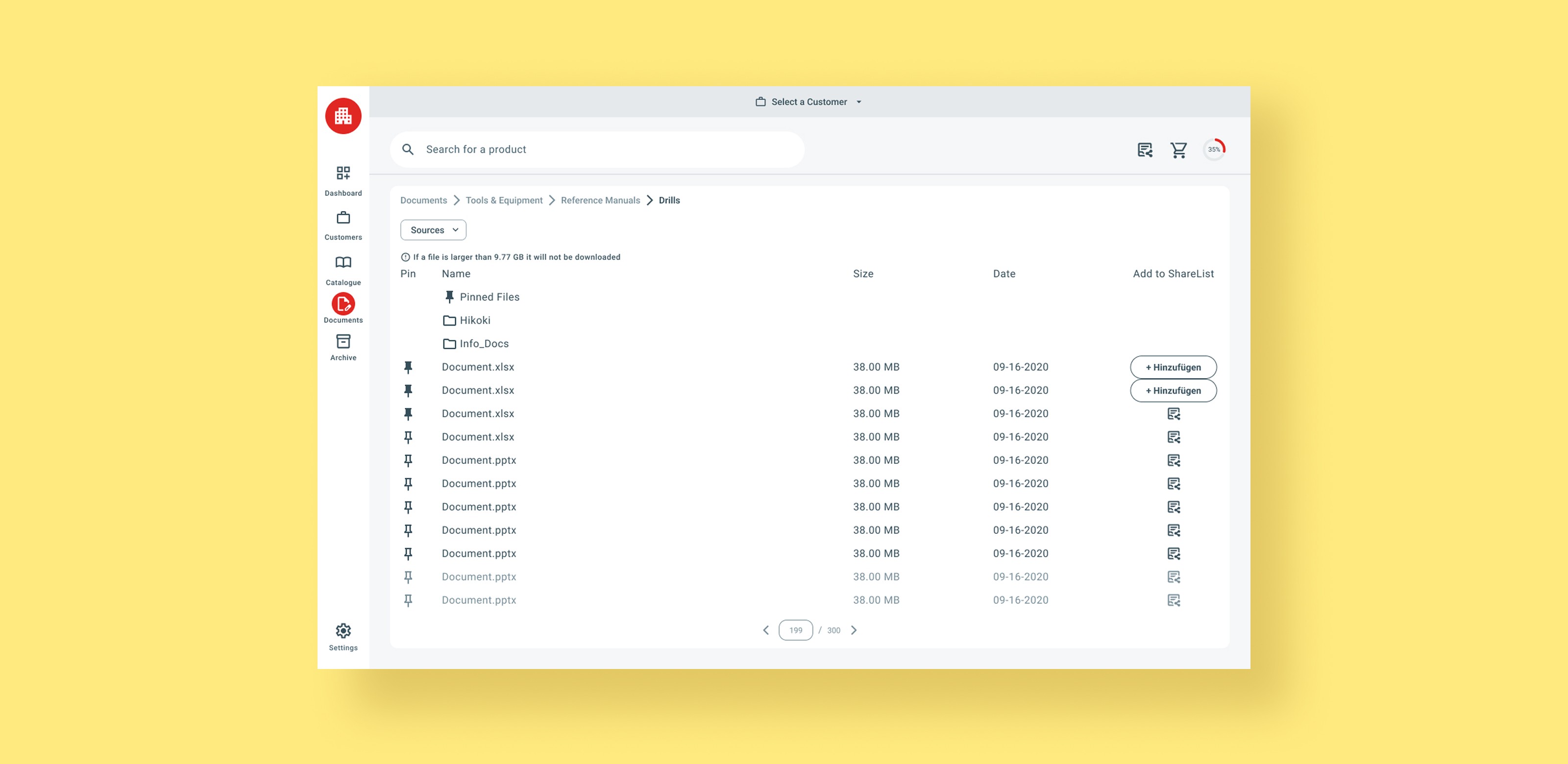
The first draft establishes a table standard for the app. An early exploration replaced the 'Share list' icon with alternatives, but feedback from the external designer led us back to the button used in the first two rows. Further feedback flagged the pinned files folder as insufficiently visible — addressed in the next section. The 'Sources' dropdown sits separately to support an overlay interaction, similar to how Google Drive and Gmail handle it.
Implementing Checkboxes
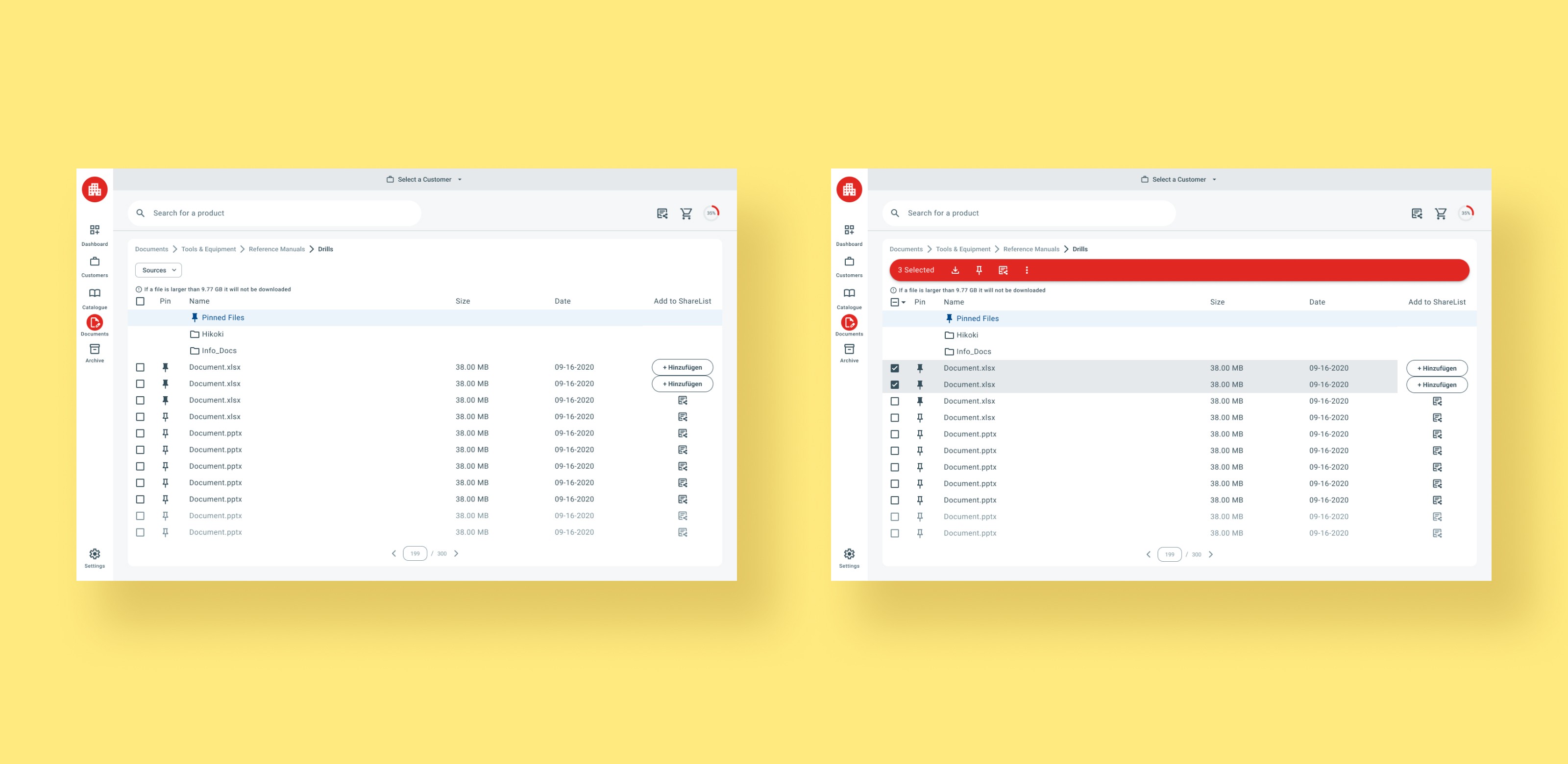
This feature was deprioritized during the project, but an early concept was explored regardless. It introduces multi-select functionality with batch actions. The version shown still uses the old 'Add to Share List' icons, leaving the red bar unresolved for the new button design — a gap that was never addressed as the feature was shelved. Focus shifted instead to finalizing the main table and introducing a 'Pinned Items' tab in place of a dedicated folder. The tabs were an existing component for the mobile design and in effort to save time, we were asked to include it in the desktop design.
Final Solution
Customers | Location Data
Sub-Problem Summary
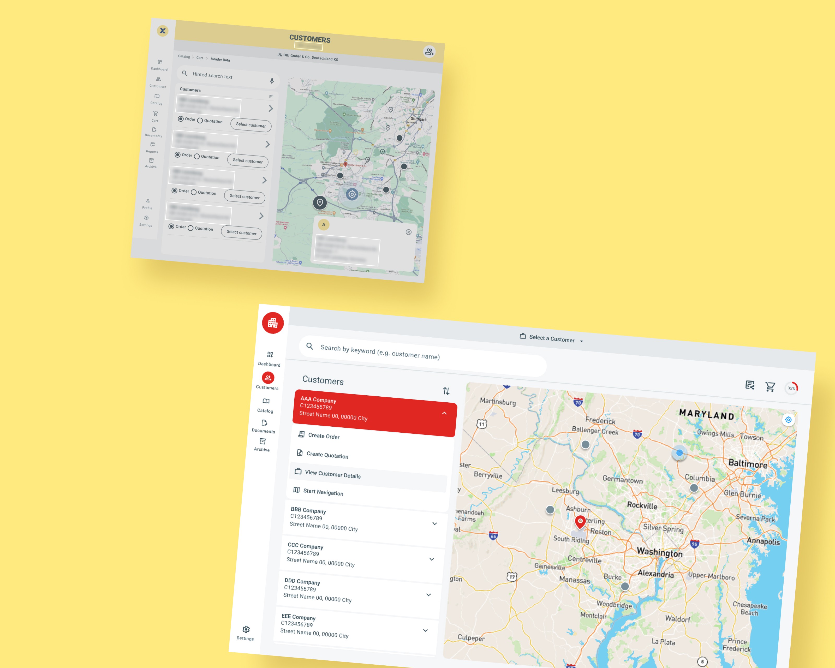
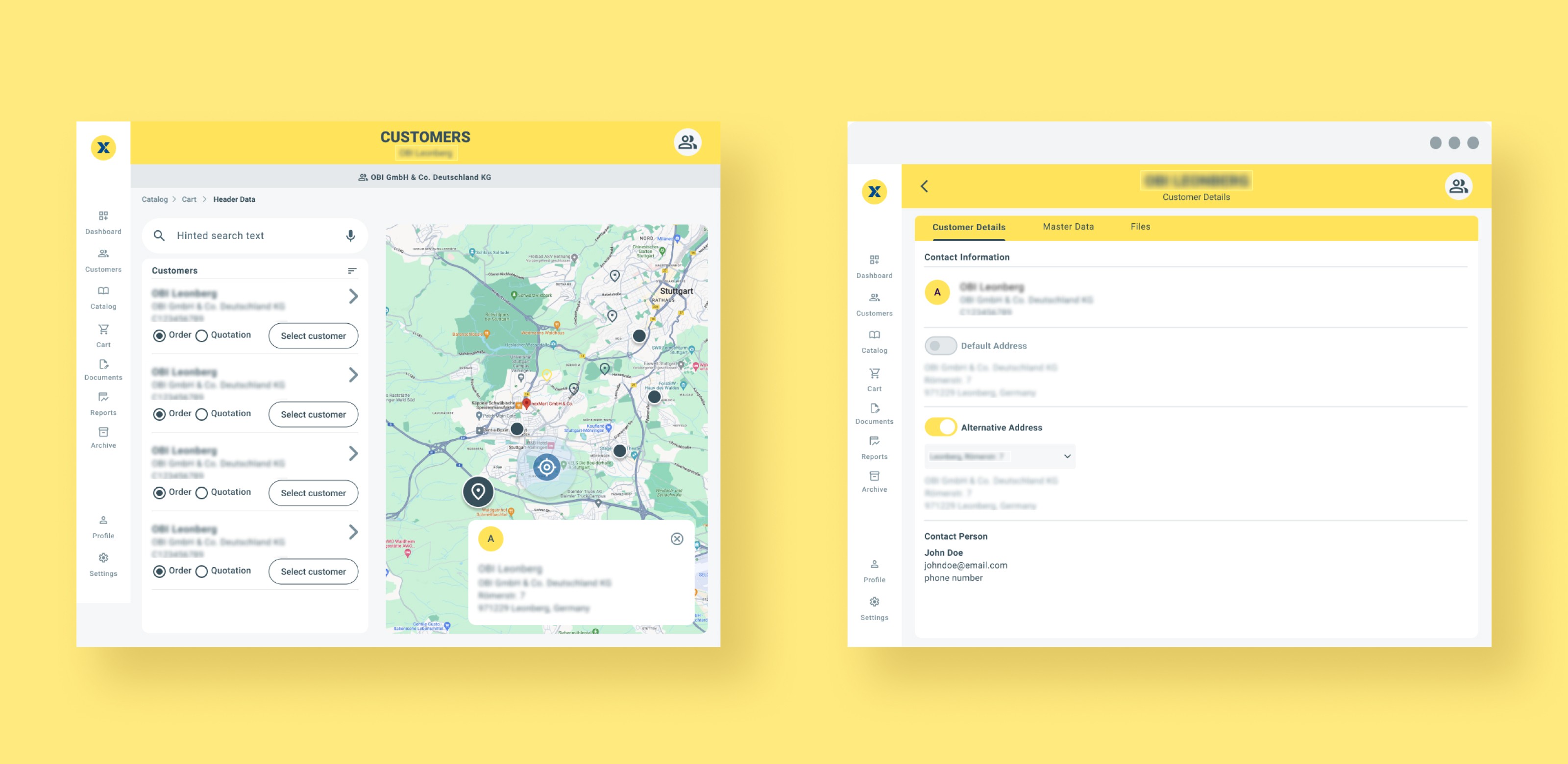
The legacy flow forced users to commit to an action (Ordering vs. Quoting) before selecting a customer. This introduced too many decisions too early. The hierarchy between the different actions is also not clear as the radio button and the confirm button sit too close to the arrow button.
Solution Summary
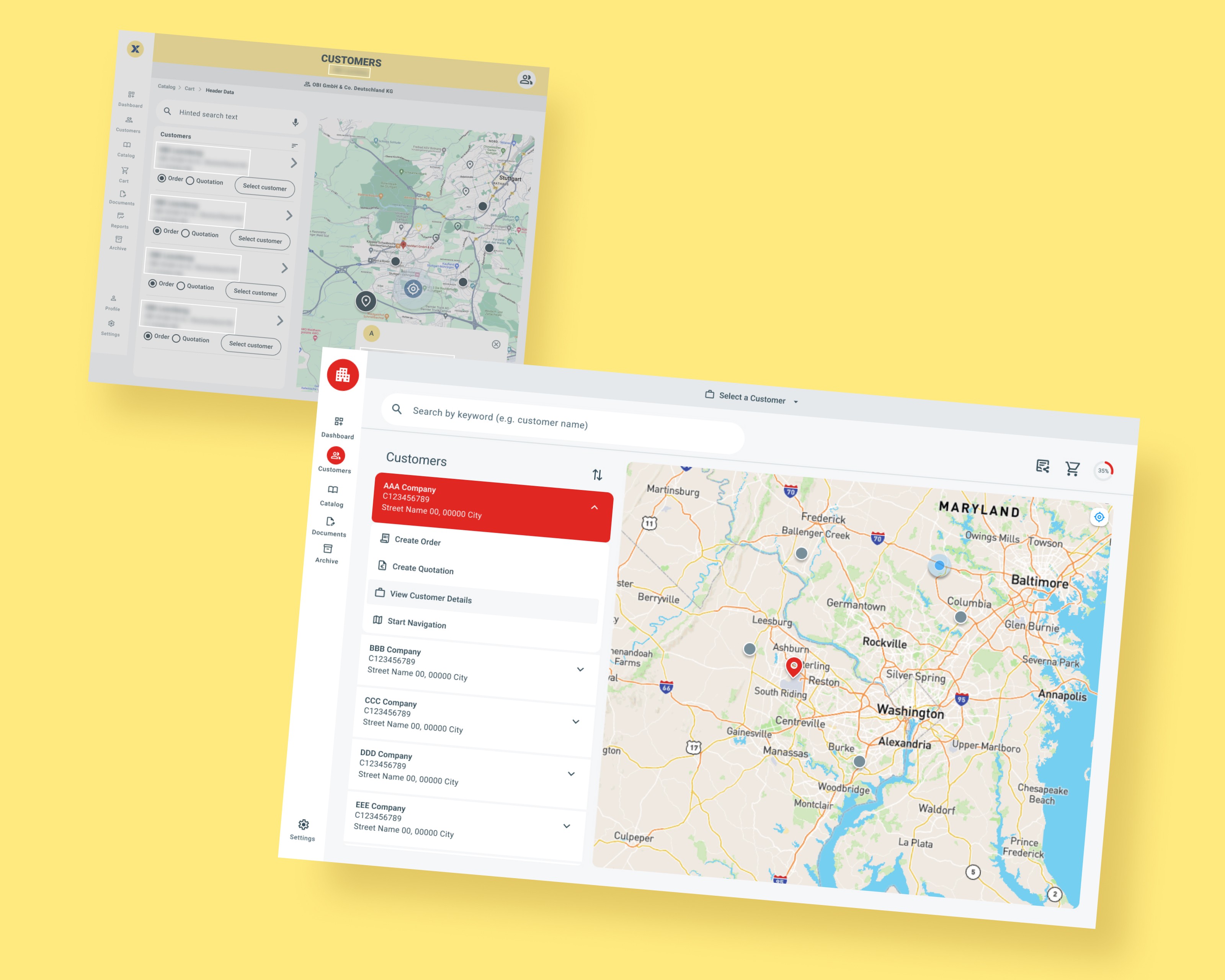
I pivoted to a Context-First Architecture. By requiring the user to identify the customer first, I transformed the Customer Detail page into a Functional Hub. This ensures that all subsequent actions are contextually relevant to that specific client, reducing 'choice anxiety' and preventing downstream errors.
Flow Restructure
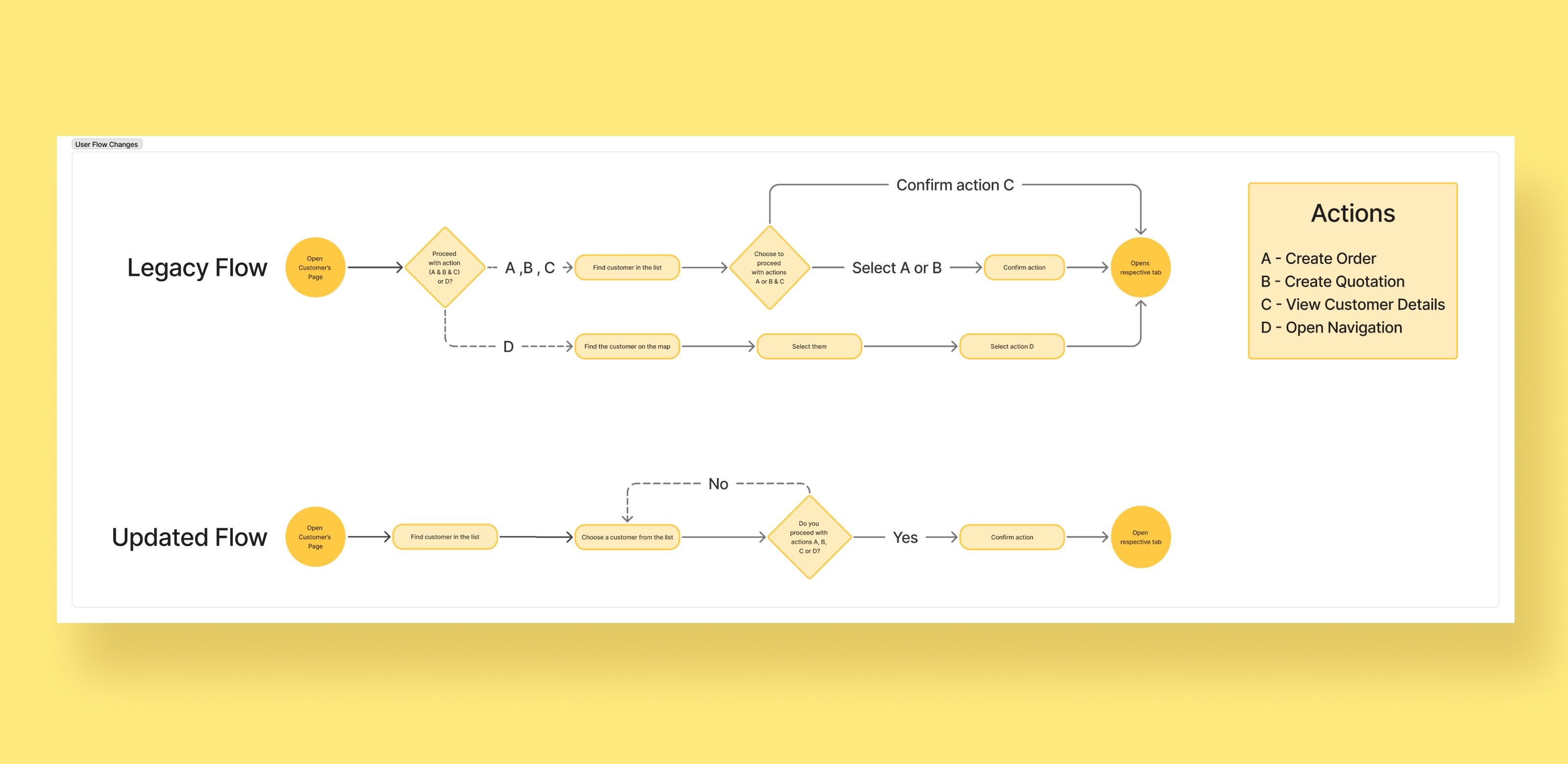
The updated flow consolidates all customer-related actions into a single section, removing the need to browse the page to complete a task.
Context-First List
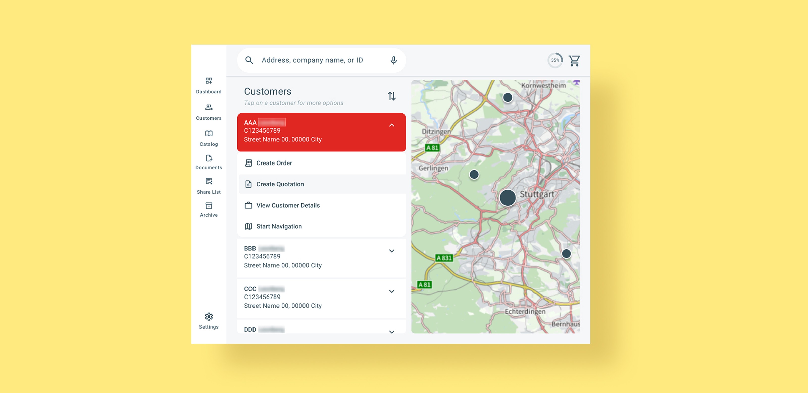
Actions are now revealed only after a customer is selected, reducing the number of options visible at any one time. This prevents decision overload and ensures every available action is relevant to the chosen customer.
Map & List Synchronisation
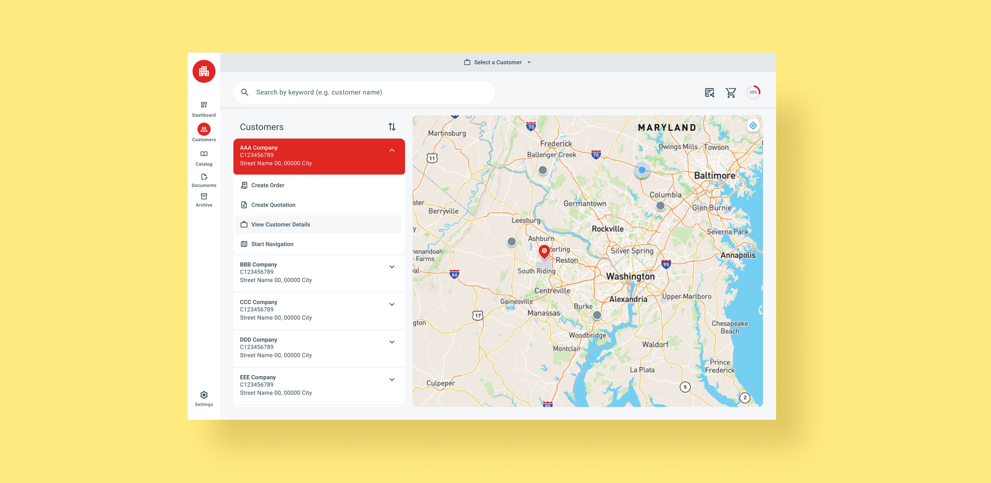
Selecting a customer on the map surfaces their entry at the top of the list regardless of scroll position, while a pin marks their location on the map. This creates a two-way connection between the two views without requiring the user to switch between them manually. On desktop, there is also a hover synchronisation between the pins and the list cards.
User Selected State
Customer Detail Updates
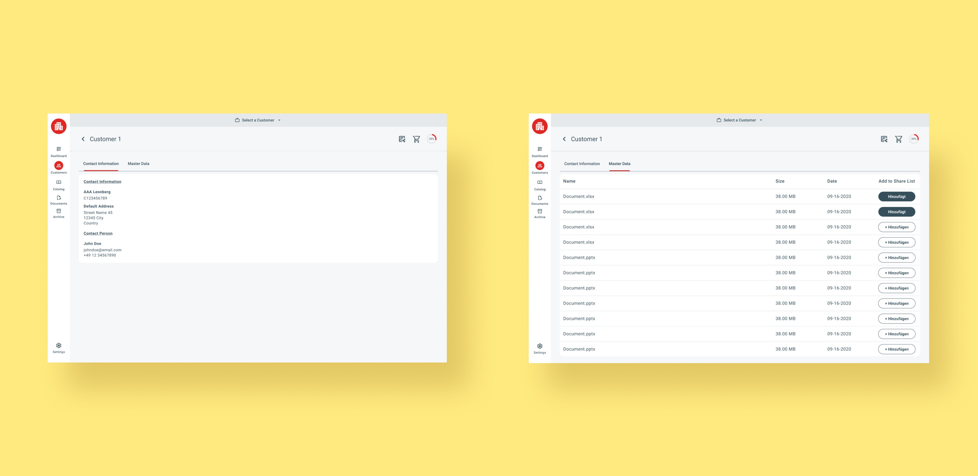
Master Data was updated to follow the table style established in the Documents section, ensuring visual consistency across the app. Contact information was restructured into a single-column layout, improving scannability by eliminating the two-column row format.
Mobile Concept
A revised mobile concept was proposed but ultimately rejected by the development team due to resource constraints within the available timeline. The shipped version retains closer parity with the legacy mobile experience.
Final Solution
Product Page | Conversion Path
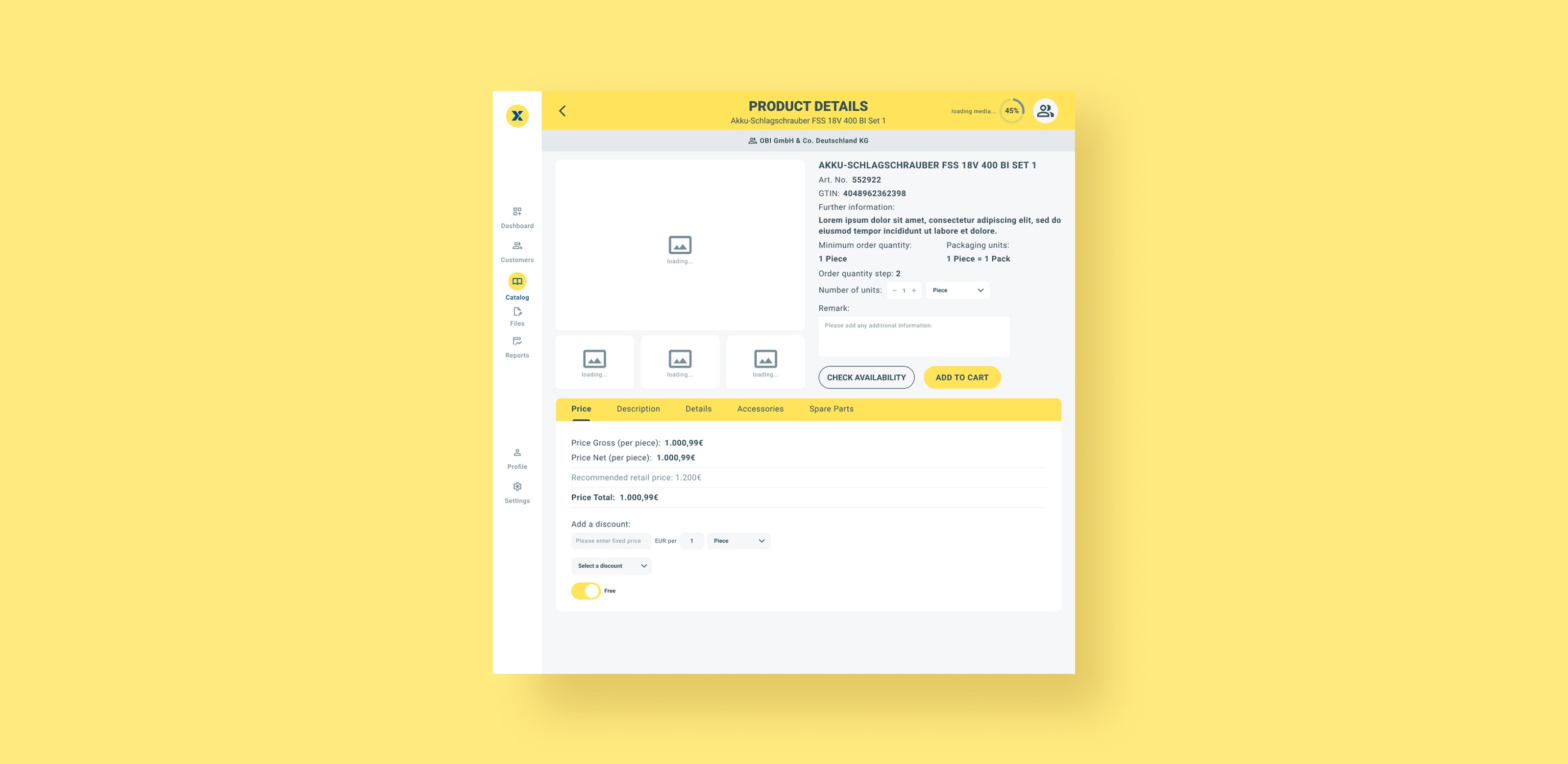
Sub-Problem Summary
The existing Product Details page lacks clear visual hierarchy, making it hard to scan and prioritize information. The availability check is disconnected from the purchase action, with results appearing far below the fold, and an ambiguous "click anywhere" interaction replacing a clear call to action.
Solution Summary
The redesign establishes a cleaner layout that makes product information easier to scan. Availability checking is simplified into a single box that acts as both the button and the result — it turns green or red and fills with stock information when loaded, without pushing other content around the page. As this interaction was not user-tested, whether it truly improves the experience is still an open question.
Finally, the style of the page was adjusted to match the revised project's design document.
Image Carousel
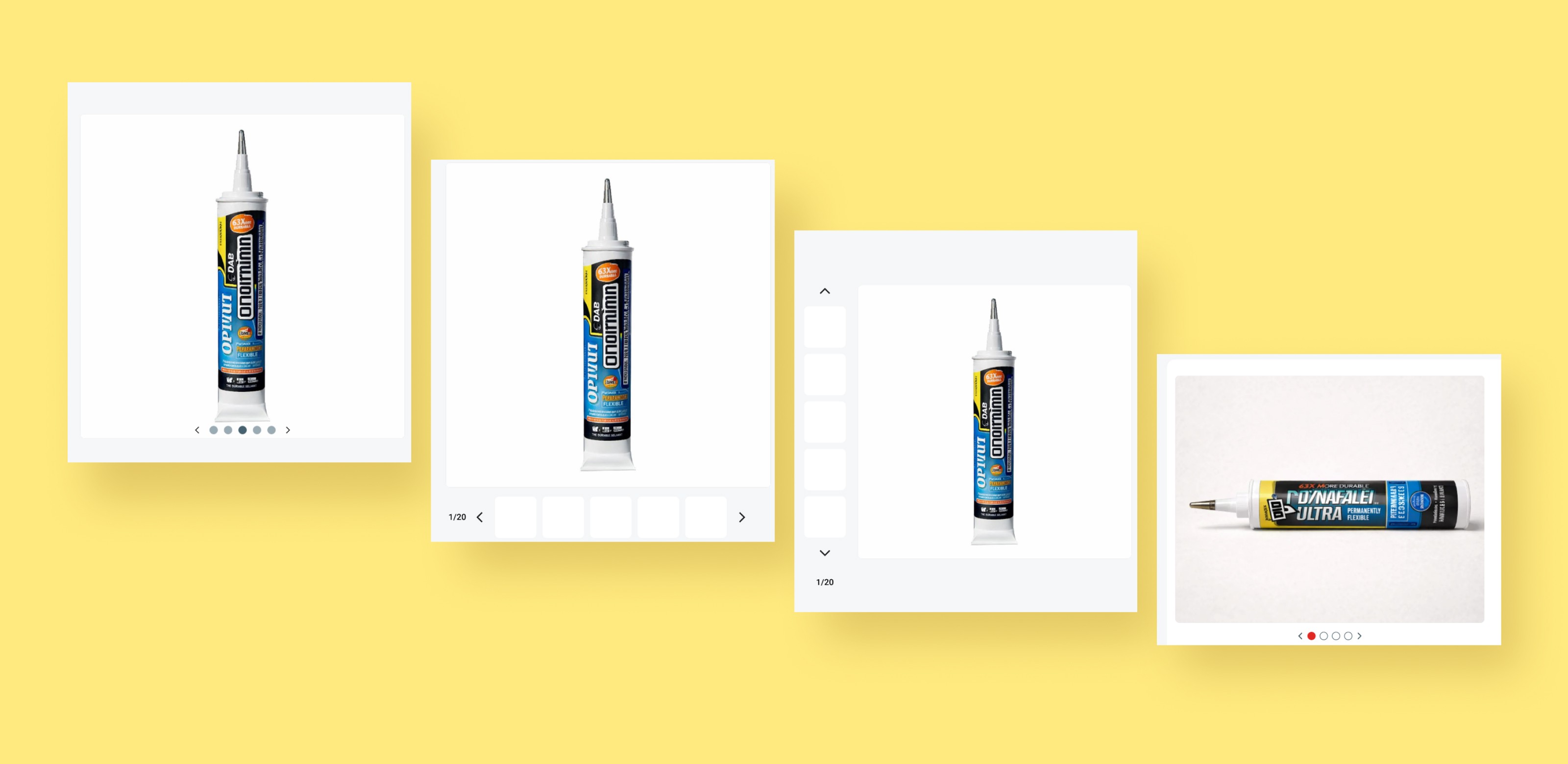
Early concepts introduced a carousel to handle multiple product images, giving users a more fluid way to browse visuals without leaving the page.
Developer-Collaborative Solution
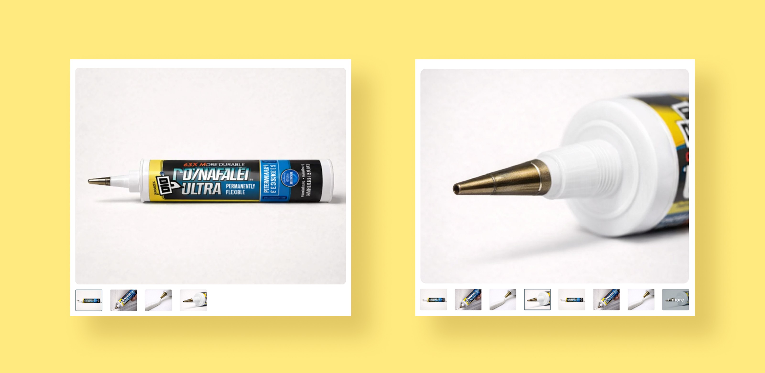
The final image layout was reached in collaboration with the development team, prioritising a solution that was both effective and realistic within the available build time.
A Buried Critical Action
The availability check was treated as optional rather than a required step, and its result appeared below the main product details — disconnecting a critical piece of information from the purchase decision.
Bringing Availability Above the Fold
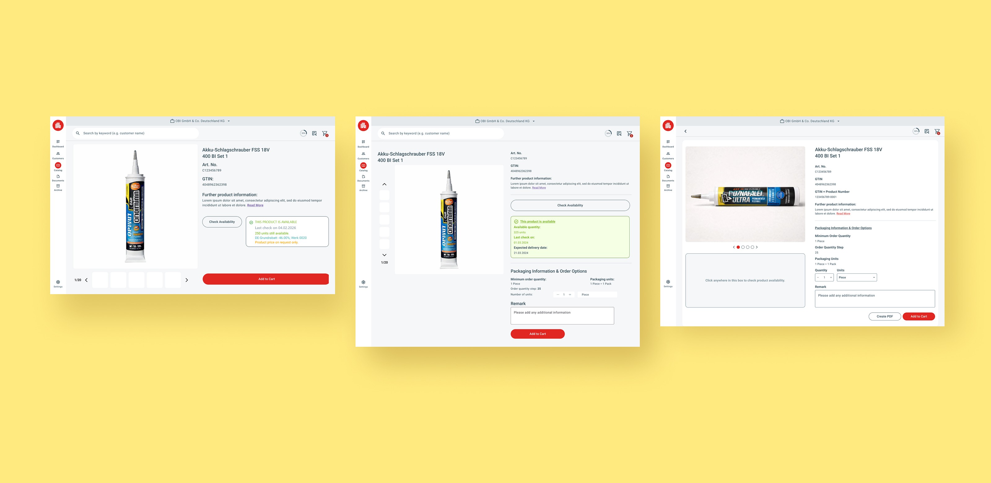
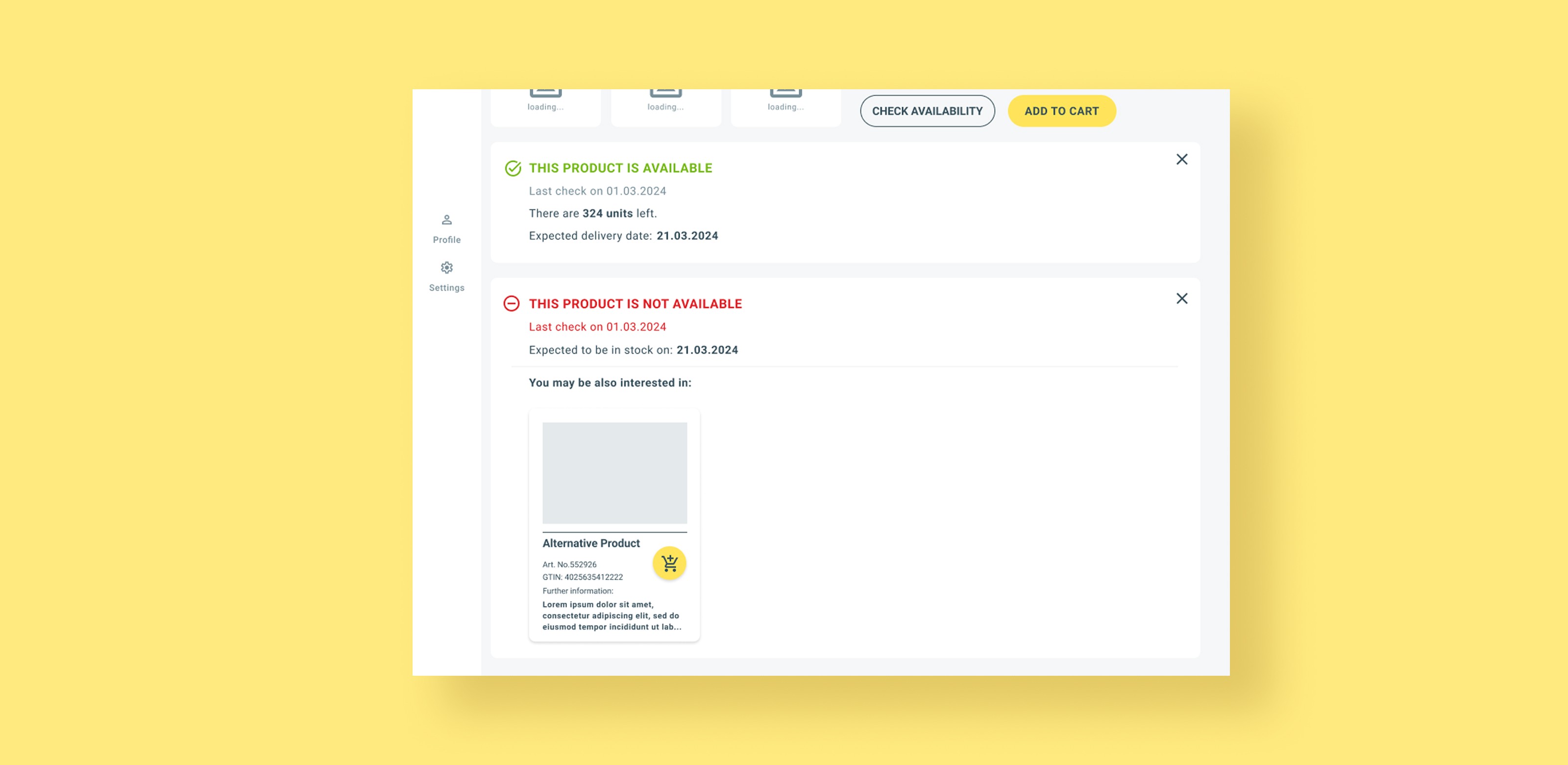
Because the check cannot be automated — a resource constraint — it needed to be unmissable from the moment the page loads. After iterations with the senior designer and PO, the availability check was given a dedicated section at the top of the page. A second version that pushed the CTA further down was considered and rejected.
Trigger & Result in One Place
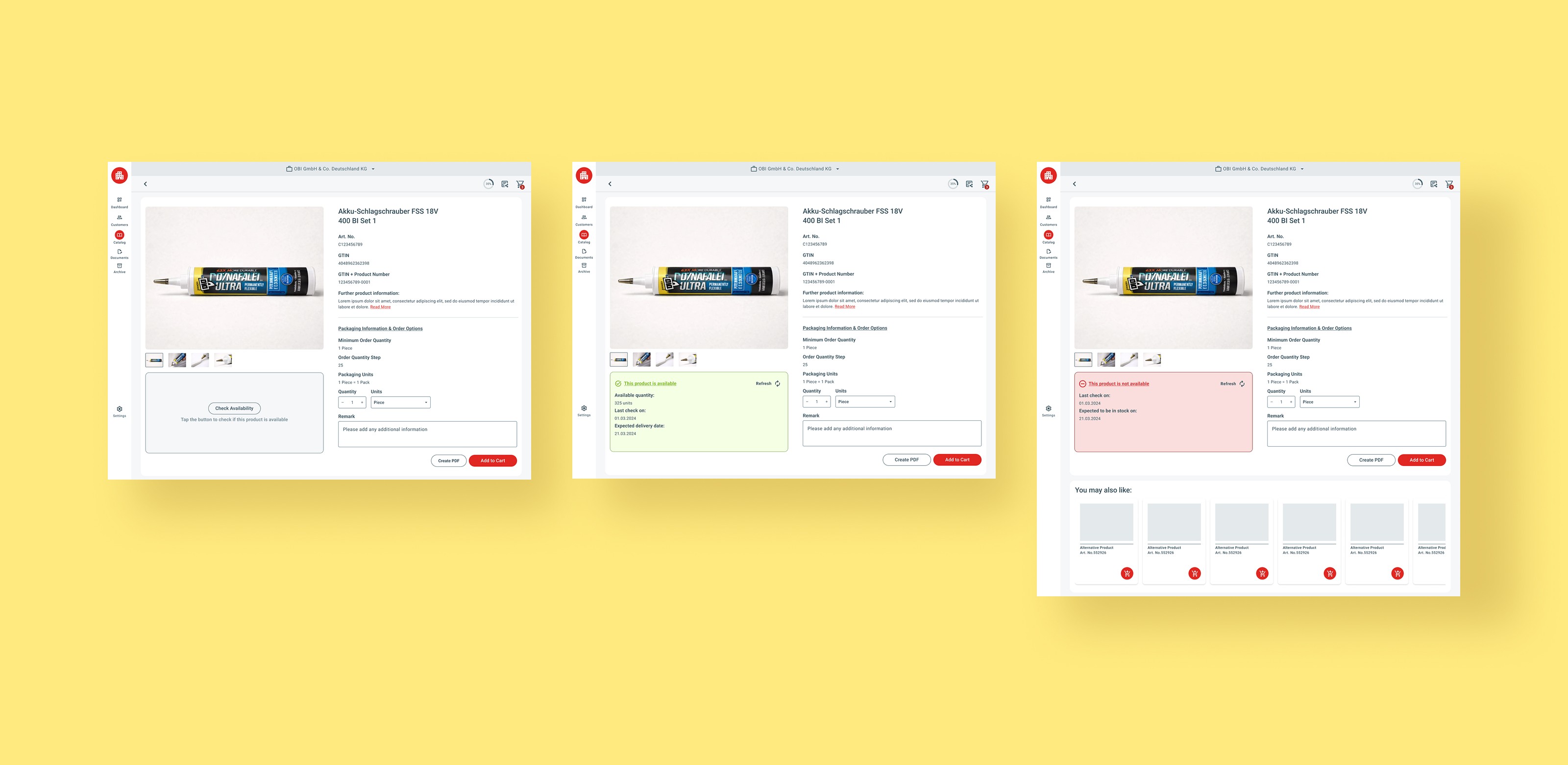
A button was added inside the box to signal that the field is interactive. Once loaded, the result is immediately visible — green or red — without any layout shift. For unavailable products, alternative suggestions appear directly below.
Tab Section on Desktop
The tab section was restyled to align with the updated design system. The Description tab in particular was reworked — shorter text blocks and a clearer hierarchy make it easier to scan.
Vertical Reflow
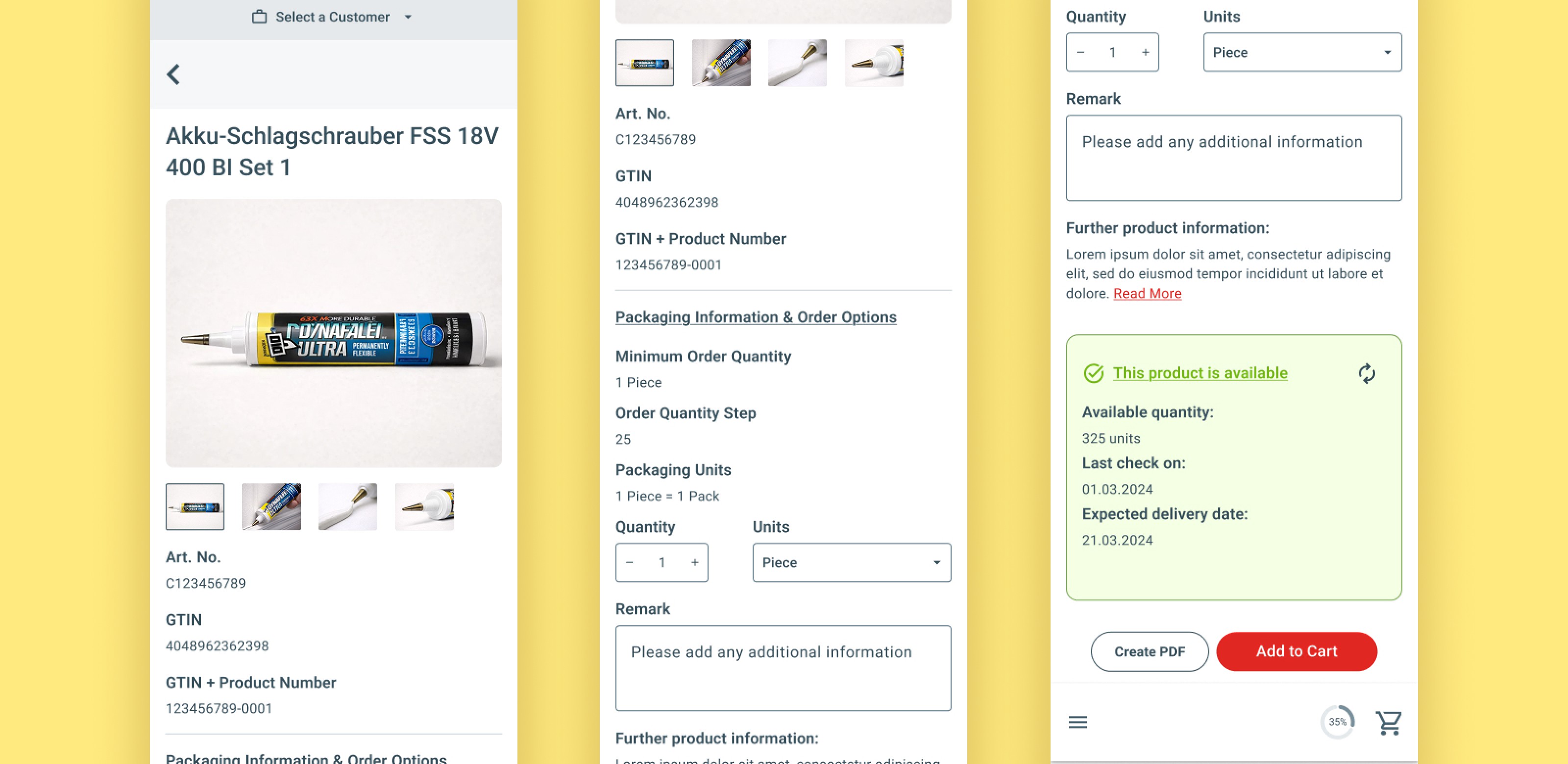
On mobile, the availability section is placed directly above the CTA, maintaining the same logical sequence as desktop within a single-column layout.
Tab Section on Mobile
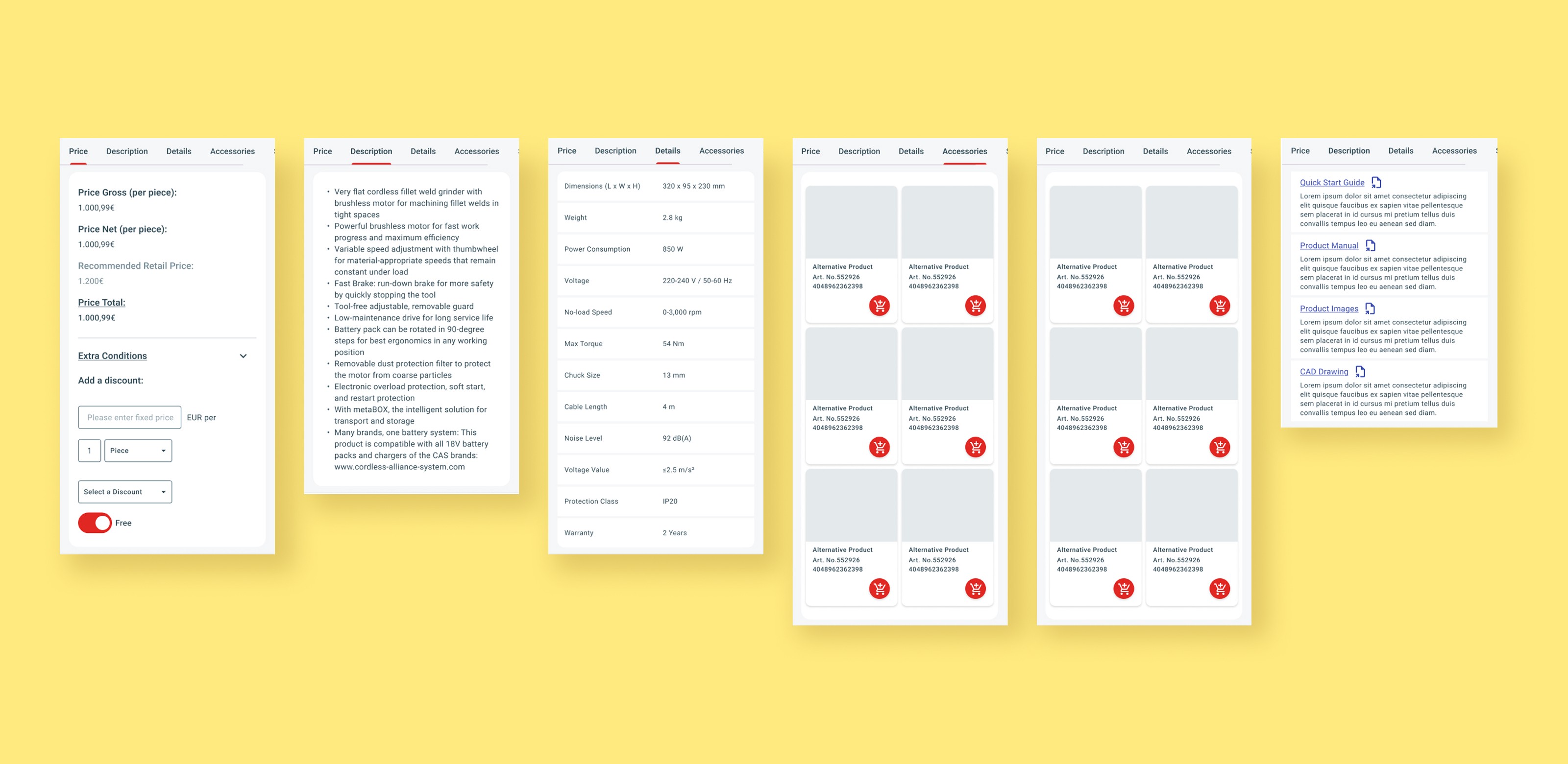
The product detail tabs sit below the main product section on mobile, mirroring their position in the desktop layout.
Final Solution
Bonus | Dashboard Concepts
Section Overview
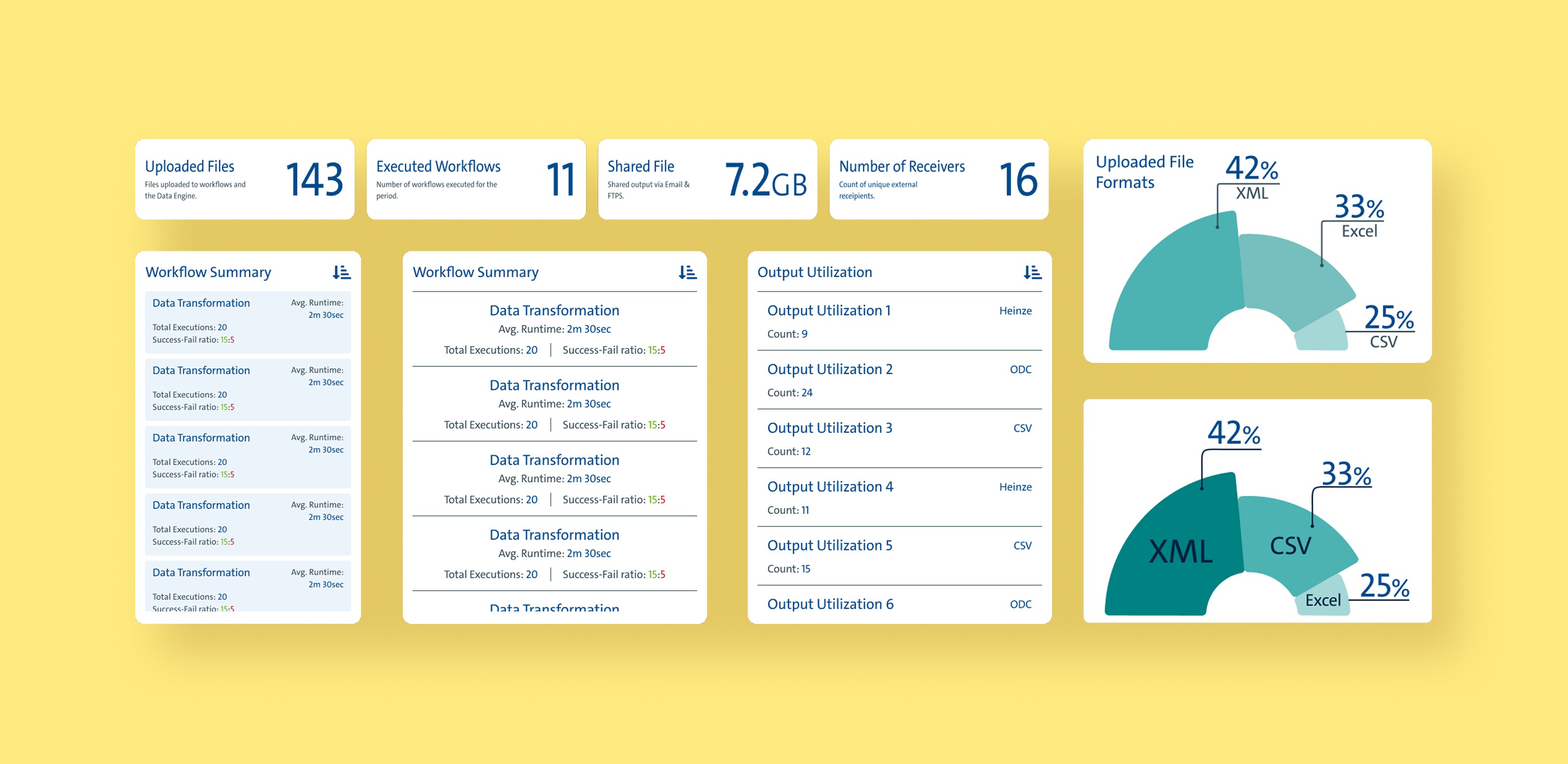
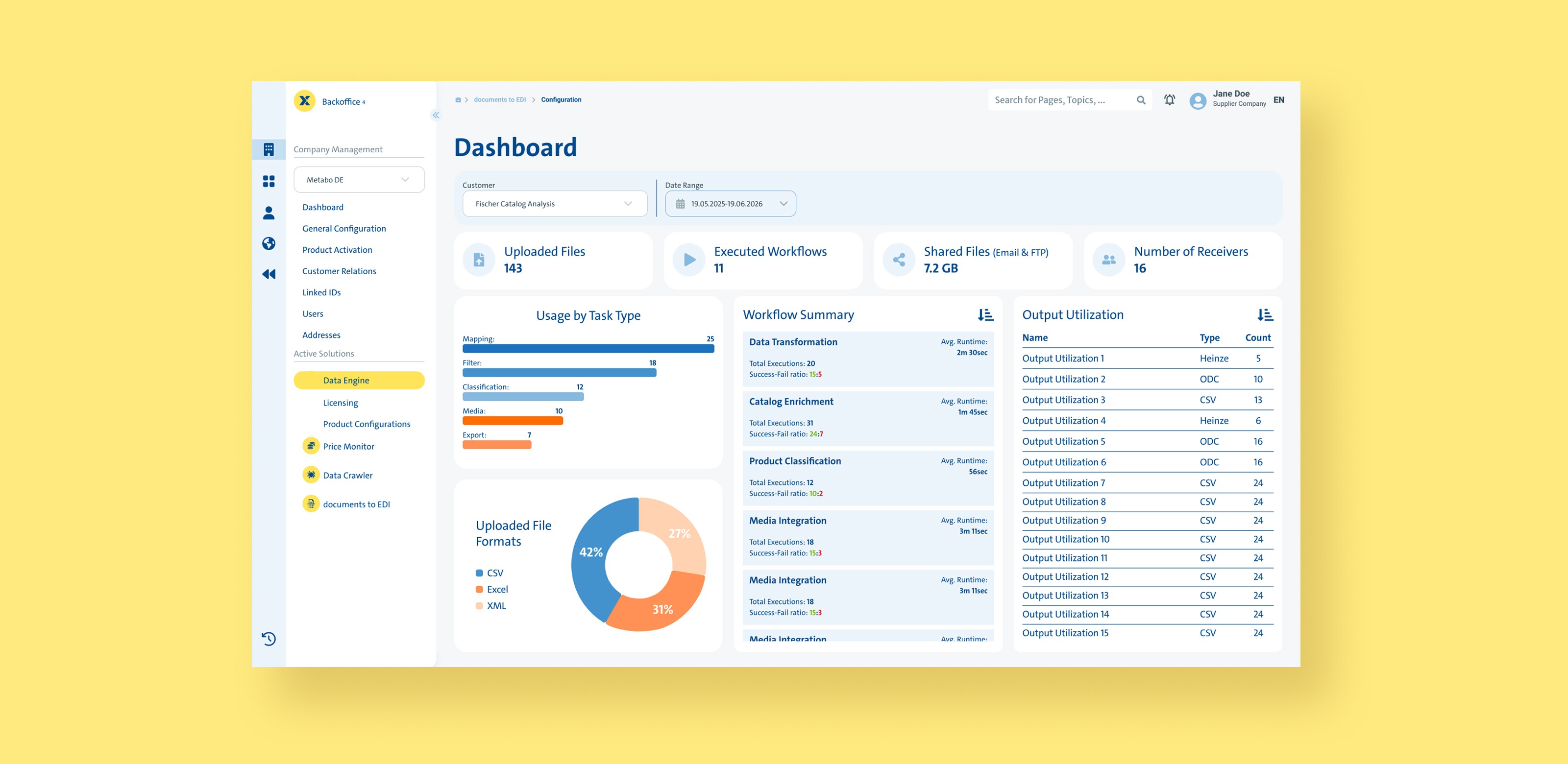
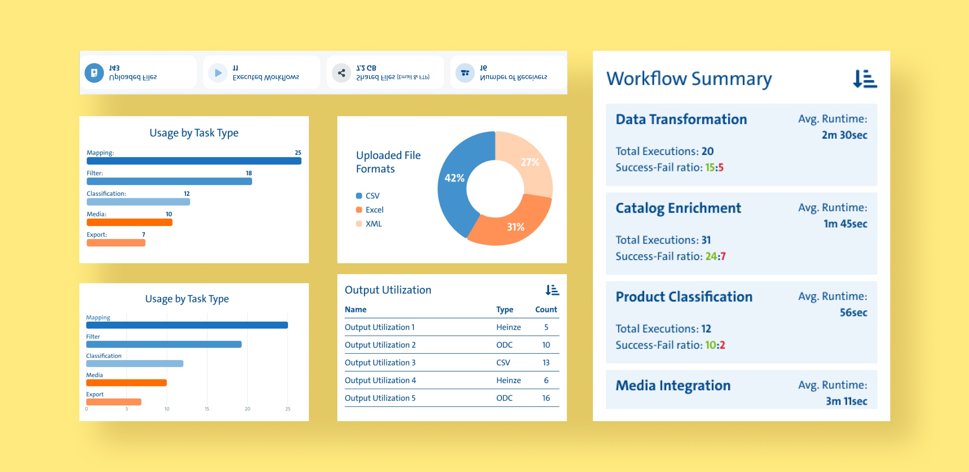
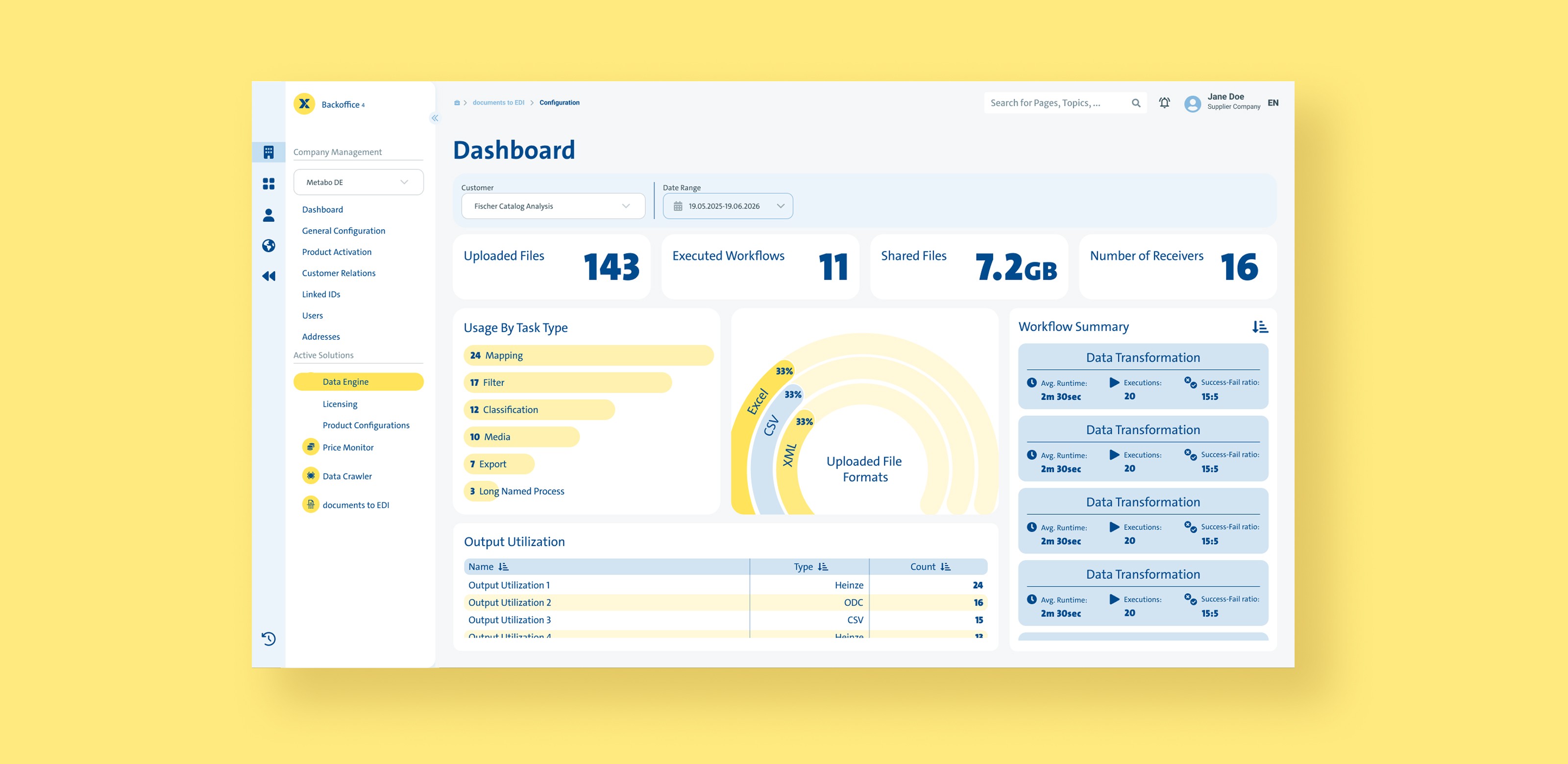
In the final week of my internship, I was asked to concept a dashboard for a separate internal app. Due to scheduling constraints, the concepts were never reviewed with the relevant teams. With data requirements undefined, the focus shifted to exploring layout and visual structure — three concepts were developed, each built around a different design pillar rather than optimised for data accuracy.
Minimalistic
Design Pillars
Simplified and Compact
Text and Numbers are mostly the same size and can be formatted as Bold
Colourful
Design Components & Alternatives
Playful
Design Pillars
Numbers are always formatted with style BLACK
Text & Labels are never formatted BLACK
Graphs appear rounded
Design Components & Alternatives
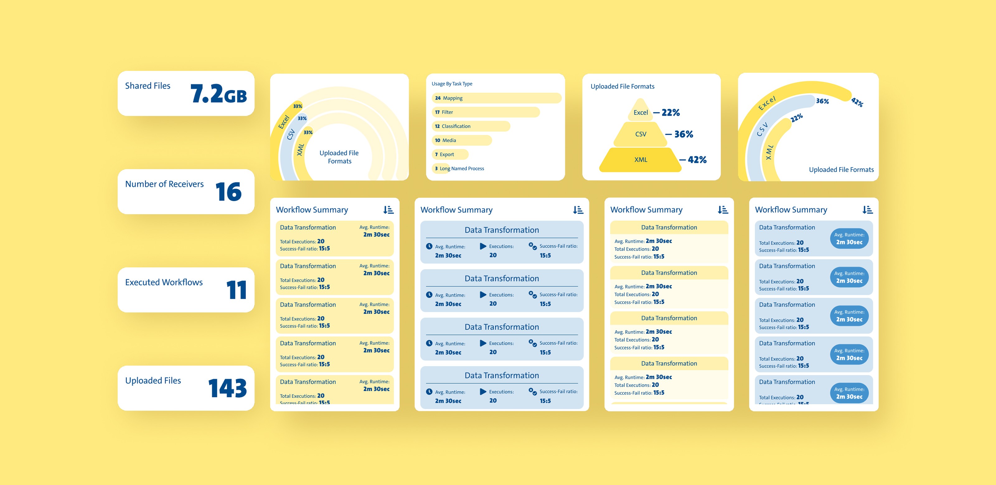
Sleek
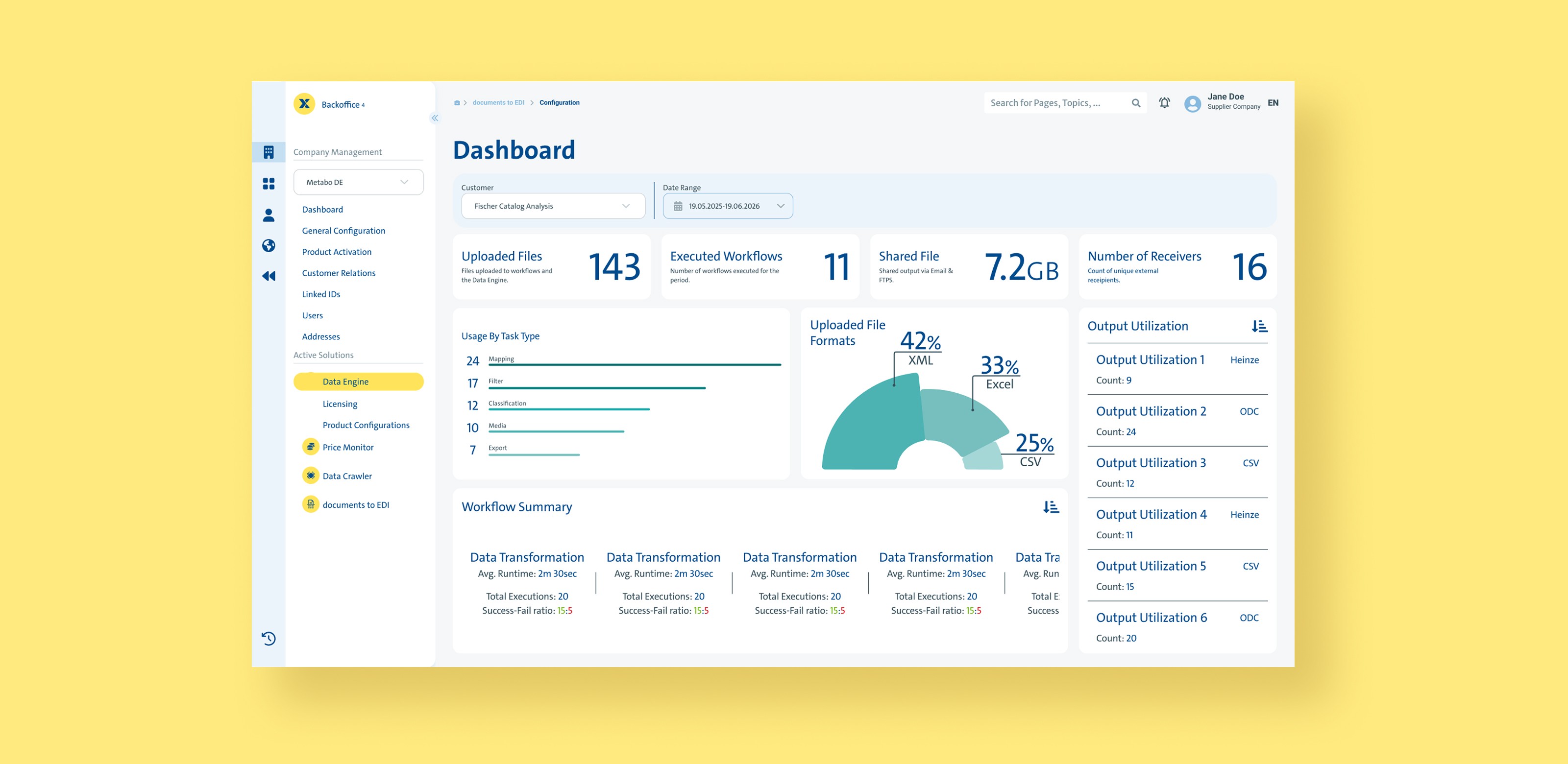
Design Pillars
Higher Detail
Balance in Both big and small - no text formatted as Bold
Monochrome
Design Components & Alternatives